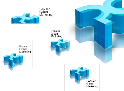
 Worked on this one in the morning. I generally like my logos simple, easily reproducible, with no effects. But with this one, I broke the conventions. I for some time been thinking that 3D logos are old fashioned. But today I'm convinced its not. I'm posting this even before I showed it to my client. I illustrated it in Coreldraw and finished it in Photoshop. Just loved working on it.
No comments:
Post a Comment